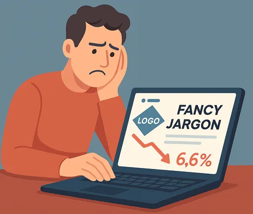
7 Landing Page Mistakes Killing Your Conversions (And How to Fix Them)
What I've learned about creating landing pages that actually convert visitors into customers.
I’ve spent the last few years launching products (failing with some, succeeding with others), and if there’s one thing I’ve realized, it’s that I had no idea how to create a good landing page. I’ll compile here some of the information I found and verified in practice, and at the end, there’s even an open-source template in case you want to launch quickly without worrying too much.
Context
I know it’s not for lack of effort. I’ve created websites that looked beautiful to me, placing prominently that logo I paid for (nowadays at least people spend some hours on ChatGPT) and bothered some designer to get it just the way I wanted (I was proud, it was my baby). I’d add a phrase I thought was super clever and… zero results.
Well, after good research (and failed products), I’ve compiled what seemed to me the 7 main reasons a landing page fails - I’ve made these mistakes many times, and you probably have too. These were the changes I made that gave the best results (and some optional but good things too).
TL;DR:
- Focus on one clear message across your entire page
- Use specific, clear headlines that solve actual problems
- Remove unnecessary distractions
- Show your product in action instead of abstract descriptions
- Include genuine social proof from real people
- Create action-oriented CTAs with clear benefits
- Minimize your brand presence (nobody cares… yet)
- Launch quickly with Landstro to apply all these principles
Mistakes
Mistake #1: Lack of a Single Unifying Message
Many landing pages try to communicate too many ideas (features, benefits, results) at once, which dilutes the impact of each solution. This confuses your potential customer; often, they don’t even properly understand what you do.
The Fix:
- Identify ONE big idea or message for your product (focus on the main benefit you bring to the user)
- Repeat this ONE message throughout the entire page (not exactly the same, but reinforcing the same point)
- Ensure all elements reinforce this idea, for example:
- The headline is “I help you launch high-converting landing pages in 2 hours instead of days”
- The product demonstration shows exactly this being done
- Testimonials show people talking about how they managed to launch their page super quickly and make sales
- Make it simple and memorable
Mistake #2: Weak, Vague Headlines
Another very common mistake I’ve made many times is exactly this. You spend a good amount of time thinking about the perfect headline, come up with a clever phrase, and think “whoever gets it will love it.” The problem is: nobody will want to stay on your site long enough to understand your headline, much less buy whatever you’re selling.
The headline is the most important part of a landing page; it does almost all the initial work. The other elements just reinforce the idea. Think about what you want the person to keep thinking about (the benefit you can bring them).
- Bad headline: “The future of web design is here” (no idea what you’re offering)
- Better headline: “Create landing pages quickly” (I know what it is, but the benefit isn’t explicit)
- Good headline: “Build a high-converting landing page in under 2 hours” (much more specific, I can see exactly what benefit I’ll get)
The Fix:
- Make headlines big and easy to see
- Focus specifically on the benefit you’ll bring, the problem you’ll solve for the user. The cool technology you’re using matters very little
- Be specific, avoid words that are clearly marketing jargon (innovative, etc). If you can put it in numbers to make it tangible, even better
Mistake #3: Too Many Options and Distractions
So the user finally arrives at your landing page, with all your blood, sweat, and Reddit posts, only to see a cluttered page with various options and give up on your product.
We’re in the era of quick information; you’re competing for the person’s attention with several other things that might seem more interesting. If on top of that your headline still has to compete with elements on the page itself to convince the customer, it will be difficult to fulfill this role.
Think about what’s essential to convey the message you want and to get the action you want from the user (whether clicking a link, collecting an email, or buying something). That’s what you should focus on. Each new link, menu, or option creates greater mental fatigue for the user. Make it as easy as possible for them to reach the conclusion you want them to reach.
Mistake #4: Abstract Descriptions Instead of Product Demonstrations
The first subconscious question in everyone’s mind who enters your site is “is this worth my time?” Vague language doesn’t answer this question - people need to see what they’re going to get.
The Fix:
- Add a demo of your product as early as possible (right after or even next to the headline is great)
- Use images, videos, or - better yet - interactive demos
- Focus on the core functionality, the part that solves the user’s pain (you don’t need to show every page of the app, everyone knows you have a login)
- Remove steps that might confuse new visitors
Mistake #5: Insufficient Social Proof
We live in a world of scams and false promises. The internet has trained people to be skeptical about products - asking for an email (let alone a credit card) requires establishing trust first.
The Fix:
- Don’t use generic terms like “users”; specify who your customers are (developers, designers, etc.)
- Never use fake reviews and testimonials (this can be spotted from a mile away)
- Get testimonials before launching to the general public if possible (look for acquaintances to test, people on X, Reddit, or here on TabNews)
- Show (with permission) photos of customers or logos of companies that have used your product, publications that have written about it
Without some type of social proof, your conversions will be poor no matter how good your product is. A good product is not enough.
Mistake #6: Generic, Forgettable Calls-to-Action
After all the work of getting attention and building trust, many landing pages lose conversions with forgettable CTAs like “Sign Up.” It’s a small thing, but think that for many people this might be the last psychological push they needed to buy your product.
The Fix:
- Have a prominent CTA button in a contrasting color. The person’s brain should guide them to this button
- Use the “Verb + Benefit” formula: “Start Converting,” “Save My Time”
- People will have objections, but you can address some right away, below the CTA:
- Does the person fear putting in a card? Start without a Credit Card
- Does the person not want to pay without knowing if it’s good? 14-day trial
- Is the person afraid of getting stuck? Cancel Anytime
- Reinforce this CTA between 2 and 3 times on the page in other sections
Mistake #7: Brand Obsession
Many times we want to put the brand front and center and very large (we’re proud of it), but the truth is that nobody cares about your brand on a landing page; you’re not known. This won’t bring trust.
The Fix:
- Keep the brand and name small
- Keep it in the top left corner, which is where it should be
- Focus on simple, functional names, preferably short
Launch a High Converting Landing Page in Under 2 Hours
This is where Landstro comes in. After experiencing these problems, I created Landstro, an open-source starter ready for production that implements these principles right from the start in AstroJS. Create your landing page in less than two hours. Get the code on GitHub.
If you don’t have a domain yet, I recommend Namecheap. For emails, this template uses Postmark.
1. Use the Template (5 minutes)
- Visit the Landstro GitHub repository
- Click the green
Use this templatebutton at the top right of the page - Create a new repository using
Landstroas your template - Clone your repository locally:
git clone https://github.com/yourusername/yourrepo.git
cd yourrepo
2. Install Dependencies (5 minutes)
Once in the repository, install with:
npm install3. Add Your Logo (10 minutes)
While installing, prepare your logo of at least 512x512 pixels, then:
- Create a logo.png with your logo (ChatGPT isn’t so bad for this)
- Place it in public/images/icon/logo.png
- Landstro’s build process will automatically generate favicons and optimize your logo
4. Configure Your Environment (10 minutes)
Copy the example environment file:
cp .env.example .envThen edit the .env with your information: (If you don’t have a domain yet, I use and like Namecheap; for emails, I use Postmark.)
# Application Settings (Required)
APP_NAME=Your app name
APP_DOMAIN=your-domain.com
SITE_URL=https://your-domain.com
[email protected]

# Contact Form Settings (Optional)
CONTACT_FORM_ENABLED=true  # Set to false to disable
[email protected]

# Waitlist Settings (Optional)
WAITLIST_ENABLED=true  # Set to false to disable
[email protected]

# Email Notifications via Postmark (Optional but recommended)
# Landstro integrates with Postmark for automatic email notifications
POSTMARK_API_KEY=your_postmark_api_key
[email protected]
[email protected]

# Analytics (Optional)
GOOGLE_ANALYTICS_ID=G-XXXXXXXXXX  # Leave empty to disable Analytics
ANALYTICS_DOMAINS=https://www.googletagmanager.com https://www.google-analytics.com

# Social Media Links (Optional, but helps a lot with SEO)
# Omit to hide the corresponding icon
GITHUB_URL=https://github.com/your-company
LINKEDIN_URL=https://linkedin.com/company/your-company
TWITTER_URL=https://twitter.com/your_company
FACEBOOK_URL=https://facebook.com/your-company
INSTAGRAM_URL=https://instagram.com/your-company

# Navbar (Optional)
ENABLE_NAVBAR=true  # Set to false to disable the navbar

# Pricing (in USD, Optional)
# Set to "FREE" to display a free tier
# Leave empty to display "Contact Us" instead of a price
PRICE_BASIC=9
PRICE_PRO=29
PRICE_ENTERPRISE=99

# Pricing Tier Names (Optional)
BASIC_TIER_NAME=Basic
PRO_TIER_NAME=Pro
ENTERPRISE_TIER_NAME=Enterprise
If you don’t provide the Postmark settings, Landstro will save contact and waitlist form submissions in the database but won’t send notifications.
5. Customize Content (60 minutes)
Now we apply the principles discussed:
-
Open
src/components/Hero.astroand change the content with:- Your big headline that communicates the benefits
- The subheadline that expands and strengthens this benefit
- A strong Call to Action using the “Verb + Benefit” formula
-
Change
src/components/Benefits.astroto focus on the results you deliver, not features:- Instead of “AI-powered Analytics” → “See exactly which channels generate results”
- Instead of “Cloud storage” → “Never lose an important file again”
-
Add product demonstrations to the Hero Section
- A simple mockup is better than nothing, but if that’s what’s keeping you from launching and starting to collect emails, launch without it and add later
-
Add your social proof in
src/components/SocialProof.astro- Add real testimonials
- Include client logos to replace those there if you have them (or even logos of places where you posted the launch, just make this clear)
-
Change the pricing in
src/components/Pricing.astrowith your action-oriented CTAs
6. Preview Your Work (10 minutes)
Check how your landing page is coming along, run:
npm run devAnd go to http://localhost:4321/ in your browser. This accesses the development server, allowing you to see code changes reflected on the site in real-time.
7. Build and Deploy (20 minutes)
When you’re satisfied (it doesn’t need to be perfect), run:
npm run buildThis will run all of Landstro’s automations (image optimization, icon generation, sitemaps, database setup, etc.)
For Docker deployment:
# Automatically generates the necessary things for production
npm run prepare-prod

# Deploy with Docker
cd production-build
docker-compose -f ../docker-compose.yml up -d
Or just use the script that does all this:
# Make the script executable (only need to run the first time)
chmod +x deploy.sh

# Run the deployment
./deploy.sh
This script loads the variables from your .env, prepares for production, sets up Docker containers, checks SSL configuration, and tells you if everything went well.
The entire process takes about 2 hours from start to finish, and you’ll have a professional, conversion-focused landing page that actually works.
Launch Now, Perfect Later
I’ve learned that a mediocre landing page exposed to real people is infinitely more valuable than a perfect one that’s never launched. With Landstro, you get a solid foundation to improve and adapt to your use.
Ready to build your own landing page? Check out Landstro on GitHub here.
One more note is that I specialize in Back-End, not Front-End, so if you, Front-End developer, are interested in contributing to this Open Source template, you’re more than welcome!
This post draws inspiration from marketing experts Marc Lou, Luis Barcala, Neil Patel, and my own personal experiences launching products.
Subscribe to the Newsletter
Get the latest blog posts, tech insights, and updates delivered to your inbox.
We respect your privacy. Unsubscribe at any time.